
This page is intended to provide InnoCentive with feedback on the new challenge data published next to selective challenges on their Open Innovation web portal. The mockup below offers some minor design changes that bring a few simple but useful design and contextual elements to the display of challenge data.
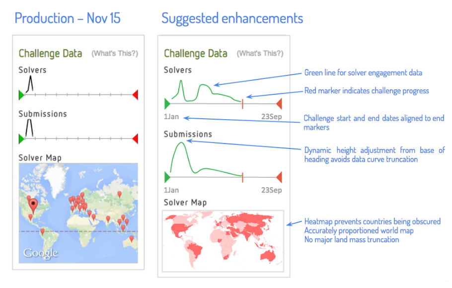
1. Green line for Solver and Submissions data curves is a purely aesthetic improvement. It is recommended that InnoCentive branded colours be used here.
2. Red marker indicates the progress of the challenge. Placed between the green "challenge start" marker and the red "challenge end" market, it provides simple yet very valuable visual cues as to time elapsed, and time remaining. This supersedes the distance markers on the sliders, which have been removed in the enhancement mockup.
3. Challenge start and end dates (taken from the coded values in the InnoCentive challenge management software database, without manual entry) added to provide context as to total challenge length. This further contextualises the visualisation of challenge length.
4. In the first image, the Submissions data curve appears slightly truncated as an artefact of high submissions early in this sample challenge. In the second image, the highest point of the data curve is shown to dynamically determine the height of the graph itself. Tricky to code, but very useful in avoiding truncated data loss and/or large vacant spaces between the graph headings (i.e. "Solvers", "Submissions") and their graphs.
5. The solver map has been redesigned to utilise a heatmap visualisation rather than map pegs to ensure portions of the map aren't obscured, as most of Europe is in the first image with some many countries clustered so close together at this small resolution.
The world map itself has also been refactored from (what I assume to be) the Google API's default homuncular worldmap which shows countries in randomised and warped proportions.
The second image also includes all major land masses (although numerous pacific islands have ben cropped), allowing for a more complete view of global activity on the challenge. (This is all very well and good, of course, for me to sketch how I think it should look, but significantly more cumbersome for InnoCentive's developers to code it.)
Disclaimer:
These enhancements are offered by the author to InnoCentive freely and without any claim to remuneration, special consideration, or official acknowledgement. These suggestions have been prepared by an active member of the InnoCentive Solver community with the sole aim of helping InnoCentive to improve its commercial website. This article and its content were produced and published in the spirit of open innovation.
 RSS Feed
