

This article makes the case that the concept of competition is an atrocious means of resource allocation, and that it's an all round bad thing to do.
First, our definition:
Competition
1. The activity of striving to gain something by defeating others.
And when does it occur?
Competition arises whenever two or more parties strive for a common goal which cannot be shared. Competition is typified by one's gain being another's loss.
Please feel free to comment with offer other definitions and your thoughts.
Incidentally, this is very close to the definition of war, which you already know to be wasteful: An armed conflict between different countries or groups within a country.
The futility in this is self-evident. After all, if you were in fact desperate enough to agree to compete for something you needed, and you subsequently lost... the agreement is over, but the competition itself is still in effect. You'd have no choice but to escalate the competition until you either die or obtain what you need. Sounds extreme, but it’s true.
This applies to everyone else who ever competed for something they needed, or believe they needed.
Competition has no place in getting anyone what they need. It could be claimed that competition has a potential fringe-use for parties competing for finite resources that they merely want. But the frail logic of this collapses under a simple example of competition as a concept.
If you compete for a thing you want, and lose... you still have the option to escalate the competition until you either die or obtain what you want. The want-driven competition loser always has this option. Therefore competition is constrained only by the will of the participants: if we compete in a game of table tennis for an item we both want, and I win, our agreement is I take the prize because I won the game. This is not the end. You still have the option of taking it off me. You could try to convince me to give you the prize anyway. You could use the same social mechanisms by which I agreed to the competition in the first place to pressure me into a rematch, perhaps upping the stakes to compel me to participate. You could accuse me of cheating and seek outside arbitration. You could outright steal it. You could use force. The "competition" at this point is no longer the arbitrary line defining the end of the agreed portion of the contest: it is the contest of wills itself.
Depending on what the loser is willing to do, this has direct implications on safety. Absurd? Most certainly. And also a commonplace occurrence. Most games end with a handshake and the loser accepting defeat and giving up on the tangible prize or status currency they may associate with winning. Some games end with harsh words. But some end (or are interrupted) in violence among participants. The rates of violence among spectators is also astronomical. And most problematic of all, domestic violence rates spike after major sport events.
In this very literal way, competition is a conflict-creation system. This system of conflict creation is mitigated only by human willingness to give-up and lose: an unrealistic solution to an unnecessary problem.
Things become far more unpredictable when competitors pit their wants against others’ needs.
Of course, YOU know where to draw the line on giving up... for the things you want. But for things you need, the things you would die without, the line is drawn for you: you must win at any cost, during or after the agreed part of the contest.
There are social contracts and institutions in place that provide us guidance in this line-drawing, and of course individual's judgement does too. That's lovely, and powerful, but the fact remains, every competition creates conflict. Such a system goes far beyond mere inefficiency: it's fundamentally opposed to human prosperity.
Anecdote: Competition Guarantees Disappointment
The following segment is an anecdote from my life in which I first encountered competition.
As a child I went to a high school that promoted competition. It was not what I would now consider a particularly good school but they did their best with what they had and one of their most effective methods of engaging the children in participating in any of their activities was to encourage us into competition.
In the sports field this was used to great effect, the school had a high performing rugby team with students who loved the game and who loved to win games against other school's teams – the praise and recognition from the faculty for winning was both their reward and their motivation.
The competition aspect was also used to great effect in the classroom, ranking students into classes by their academic success, and reconfiguring those classes each year as students either achieved great grades, achieved poor grades but persisted, or gave up.
I was no athlete and certainly no academic (belonging in the 'gave up' category), but whenever I put effort into either, I was encouraged by the school to compete. Not knowing any better, I did compete.
About half the time I was on the losing group or team, and seldom in individual pursuits I wouldn't come in first place. Everything was pushed into being a competition for grades, results, always primarily measured against each other rather than against our own individual prior achievement level.
Participation was expected, not rewarded, but losing was always a disappointment: when I did my best, I had nothing to show for it: the teachers were very encouraging before the activities in drumming up participation but totally disinterested in anyone but the winners of each activity. This, I could live with: I didn't want to be there, and if not for my legal obligation to attend high school, I wouldn't have.
But my view of competition became more informed when I began to win things and see it from the other side.
I was quite interested in drawing, writing, and designing and the written word was one of the few things I managed to convince myself to stick with throughout my feeble school career. In a few creative writing activities the teacher marked my entry with the highest score, and to my surprise I found the reward of being explicitly praised by my teacher in front of my peers was a far greater disappointment than all the times I had not been acknowledged at all. For that brief couple of weeks when I was ranked with the highest marks in my English class I realised that praise is something I could give myself, and far better than any teacher or anyone else ever could. The significance of my realisation that others' approval isn't something I want to compete for was compounded by seeing the disappointment amongst my peers. That my success relative to others didn't elevate me; it alienated me. Their mostly mild disappointment was the price they paid for my achievement, and my achievement gave me a reward I didn't want. What a futile activity! I realised I'd much prefer someone else in my class who actually wanted that recognition to gain the highest mark and be acknowledged by the teacher. And I understood it would have been better for me to accept the anonymity of failure so that at least someone could have the outcome they wanted.
So I stopped participating in the writing competitions, moving my interest in drawing, writing, and designing out of school and into personal and ultimately professional pursuits. I learned to give myself praise whenever I wanted some. It felt good to no longer try my best at a school that didn't particularly care. And it felt right to allow the more competitive-minded students to try and get as much teacher-praise as they could without any further intrusion from me into their world.
I had a similar experience in a high school athletics day which widened my disillusionment with competition as a concept (rather than my original distaste for it being associated only with the context of my school classes). One sunshiny summer day we all got the day off our classes to go to our sports field and partake in Olympic-style athletics events: sprints, endurance running races, long jump, high jump, discus, shot put, and javelin throwing. I had done no training of any kind and never played sports, so it was to my surprise that I ranked in some of the activities I participated in. The reason for that was obvious at the time: I'd had a convenient adolescent growth-spurt recently which gave me a considerable height advantage and therefore athletic advantage. At first I was delighted at seeing what my body could now do! I tried my best, and even came close to winning at the high jump, as could be expected from such an excited young giraffe.
At the end of the day there was a small ceremony in which students who scored highly were acknowledged by the principal. My name was mentioned. The discomfort was immediate. It felt silly to be praised for "being athletic" when I, and everyone else, knew it was just because I was tall.
Seeing the expression on the face of one a friend who happened to be considerably shorter than I was, who I knew had spent months seriously training for the activities I'd beaten him in. He'd trained for athletics day to make his dad proud. His dad was one of the teachers at our school. My friend received no recognition of any kind in that little ceremony where he should have been named sportsman of the year. Rather than what was right, the competition-system compelled the school to consider him an underachiever who wasn't worth mentioning.
(Thank goodness his grades were always phenomenal and he now has a very successful career early in which he worked in the military... I suspect with something he wanted to prove.)
Competition, I concluded, was beyond a joke. It systematically insulted people I cared about, and carried no value of any kind that was detectable to me, a person interested in fairness, respect, and equity.
Doing away with competition was a useful epiphany to have, and it's one that has been rewarded consistently throughout my life. Winning, to me, has always felt more disappointing than losing. And of course it does; If I happen to be the best at an activity, then what do I gain by showing off at beating others at things they're good at? Why would I want to be perceived as something I'm not: a person who compares himself to other people? The only comparison I acknowledge as valid is the person I am now against the more ignorant person I used to be. Winning, therefore, just seems like foulest manners. I'd be infinitely better off spending that time making myself available to others who may want to learn how I get the results I get. This is fundamentally selfish of me; I gain more when I sit down and collaborate with someone I share a mutual interest with in which we both benefit, rather than go head to head with them over ego and either defeat them or be defeated by them for no benefit.
And what about losing? That carries no appeal to me either. I'd much rather use the time spent competing to simply practice the activity I want to be good at and let the results speak for themselves to anyone who might want to see them.
But enough about me. Let's get back to evaluating the concept of competition.
Competition as Resource Allocation is Just... Gambling
Unlike in my school career, not every competition is for unwanted rewards. Sometimes if you win you do get a prize you want.
Much of the time competition provides a "winner takes all" access to prizes. Prizes are resources. Some are infinitely renewable, some are finite, and only an infinitesimal few are one-of-a-kind. But whatever the prize, make no mistake: competition is no more than a form of gambling. It's gambling by its second definition:
Gamble
1. To play games of chance for money
2. To take risky action in the hope of a desired outcome
And it's gambling even when dressed up with idiotic idioms like "a test of skill", or "may the best man win". The latter saying shares the same irrational basis as the shocker "the end justifies the means".*
In reality, only design principles can justify a means. Ends must be sought not at any cost, but at reasonable cost. In this way, using competition as a resource distribution system is where the competition gets really out of control, because there is more than people's feelings are at stake.
There are many arguments for competition, all of them fundamentally juvenile.
And my personal favourite: "Competition keeps our economy free from monopoly."
But the opposite of competition is not monopoly (the opposite of which is monopsony -- where there are many providers and only one buyer. The fundamental problem in either scenario is obviously lack of diversity of actors).
The opposite of competition is cooperation. (I typically call it collaboration, so I'll continue to do so throughout this article).
This is in the same way that the opposite of exclusive benefit (I win, you lose) is mutual benefit (I win, you win). The beautiful thing about mutual benefit is that it can be scaled infinitely to intentionally include others: I win, you win, they win, and they win, they win too, hey they also won, he won, she won, even your mum won.
Everyone wins in a business transaction, for example, in which one of the outcomes improves our environment, or reduces global waste. The provider closes the deal (win), the buyer receives their service (win), and water use in production of their product is reduced by x% (we all win). "Win-win-win", as they say in the USA.
For this reason, any interaction model that deviates from mutual benefit as a basis is not necessarily something we should recognise as valid. I am talking about viewing competition as a wasteful vanity that you should reject in favour of collaboration, perhaps in all cases.
Why should we view collaboration as our default go-to option when designing interactions?
Because mutual benefit collaboration is based on the fundamental expectation that in any scenario which is win/lose the remedy is not to participate in it, but to involve more actors. This means it is always applicable.
Let's refer back to the definition of Competition and consider again when it occurs:
Competition arises whenever two or more parties strive for a common goal which cannot be shared.
There is a gross assumption in the above sentence which we would do well to stand up to and challenge. "A common goal which cannot be shared."
Why can it not be shared? Says who? Says you? Why? Let's go a couple of levels into why, and examine the reasons for those reasons. Make no mistake, this tenuous activity requires courage, reason, and respect from all parties. We have all experienced those unconscionable situations where someone simply asking "why?" has gotten an outraged response, usually resulting from a person unwilling to contend with the reasons for their own desires, actions, and goals and finding conflict genuinely more appealling than introspection. To my profound and lasting shame, I have been that person more than once and very likely will again. It has never been worth it. Had I the courage to delve in and answer the question why, I could have avoided making conflicts with others. In those cases where I did take that plunge I managed, invariably, to explain the assumptions upon which my beliefs are based to allow them to be challenged and improved, benefitting me enormously (though at considerable effort).
Just explain, in terms we can agree on, exactly why the common goal cannot be shared. Without getting angry about it. And you will thereby be on the path to simply designing a collaboration in which you'll see that the common goal can indeed be shared, and only at the expense of a few of the wrong assumptions we all carry around.
I've talked that up quite big. So next, let's take a look at a simple exercise and see in simple charts all the ways it can play out in a competition-scenario (exclusive benefit scenario), and all the ways it can play out in a collaboration-based scenario (mutual benefit scenario).
A Charted Comparison of Competition vs Collaboration
Let's now take a look at the charts using a simple, scalable scenario involving fresh, juicy, delicious fruit.
The scenario is:
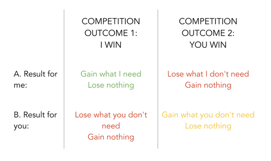
I have an orange, but I need a banana.
You have a banana, but you need an apple.
Each of us has one thing, each of us needs one thing, but there is an asymmetry to this scenario in which only one of us has what the other one wants.
The competition model allows for a "winner takes what loser has" outcome. This has a 50% chance of me getting what I need, a 50% chance of you getting something you don't need, a 0% chance of you getting what you actually need, and a 0% chance of both of us getting what we need.
The entire outcome scope is described in this diagram:
The scenario is:
I have an orange, but I need a banana.
You have a banana, but you need an apple.
Each of us has one thing, each of us needs one thing, but there is an asymmetry to this scenario in which only one of us has what the other one wants.
The competition model allows for a "winner takes what loser has" outcome. This has a 50% chance of me getting what I need, a 50% chance of you getting something you don't need, a 0% chance of you getting what you actually need, and a 0% chance of both of us getting what we need.
The entire outcome scope is described in this diagram:
This, I'm sure you will agree, is an inefficient system for resource allocation. In none of the potential outcome columns is there an outcome scenario in which everyone gets what they need. Right away this shows that we have an inadequate system. But it’s even worse than not good enough. In either scenario, there is one participant who is worse off at the end than they were at the start.
Observations:
In a world like ours with more resources than humans could ever need? That’s bananas.
The principle applies directly to the service-based economies that sustain our livelihoods. Replace "orange" with “indemnity insurance”, "apple" with “$400”, ", and "banana" with “new tyres”. Here, where it applies every day, the stakes are raised: livelihoods can depend on our interactions.
It also applies politically: I remember in the Netflix show Designated Survivor the United States president faces a scenario in which an American citizen falls into custody of the Russian government, and the US doesn’t have any Russian nationals in custody to trade for his release. The savvy president determines that by involving a third party government in the deal. That third party is a country to whom the US can release one of their spies in custody in exchange for that third party releasing to Russia one of theirs. It creates a scenario in which all three countries benefit by bringing home one of their people from detention by a foreign government.
Its cleverness aside, it exemplifies the value of designing interactions that mutually benefit all parties involved.
In foreign policy this principle offers a useful tool not just for trading prisoners (again, like pokémon) but also in brokering trade deals that benefit all nations involved and develop the bonds of mutual trust between them, in cases where all parties can bring themselves to do what is sensible.
Use of this mutual benefit tool in this context (or any context) of course depends on such points of leverage existing. But this doesn’t diminish its value to the aims of these participants.
In more complex scenarios, there are multitudes of potential includes, and therefore multitudes of solution options.
So why shouldn't we collaborate? Why shouldn't we always seek options to include others, and create mutual value in every interaction?
It's because it requires effort, trust, and vulnerability. These resources are unavailable to cowards; people who are more interested in how they might be perceived than they are in doing what is right for themselves and others. Violence may be the last refuge of the coward, but I am convinced that competition is among the first.
Let’s now take a view of the full outcome scope of our fruit scenario again, this time with a collaboration outcome made possible by someone having what you need and needing what I have:
Observations:
- This competition has a 50% chance of 50% of participants getting what they need
- It has a 50% chance of 0% of participants getting what they need
In a world like ours with more resources than humans could ever need? That’s bananas.
The principle applies directly to the service-based economies that sustain our livelihoods. Replace "orange" with “indemnity insurance”, "apple" with “$400”, ", and "banana" with “new tyres”. Here, where it applies every day, the stakes are raised: livelihoods can depend on our interactions.
It also applies politically: I remember in the Netflix show Designated Survivor the United States president faces a scenario in which an American citizen falls into custody of the Russian government, and the US doesn’t have any Russian nationals in custody to trade for his release. The savvy president determines that by involving a third party government in the deal. That third party is a country to whom the US can release one of their spies in custody in exchange for that third party releasing to Russia one of theirs. It creates a scenario in which all three countries benefit by bringing home one of their people from detention by a foreign government.
Its cleverness aside, it exemplifies the value of designing interactions that mutually benefit all parties involved.
In foreign policy this principle offers a useful tool not just for trading prisoners (again, like pokémon) but also in brokering trade deals that benefit all nations involved and develop the bonds of mutual trust between them, in cases where all parties can bring themselves to do what is sensible.
Use of this mutual benefit tool in this context (or any context) of course depends on such points of leverage existing. But this doesn’t diminish its value to the aims of these participants.
In more complex scenarios, there are multitudes of potential includes, and therefore multitudes of solution options.
So why shouldn't we collaborate? Why shouldn't we always seek options to include others, and create mutual value in every interaction?
It's because it requires effort, trust, and vulnerability. These resources are unavailable to cowards; people who are more interested in how they might be perceived than they are in doing what is right for themselves and others. Violence may be the last refuge of the coward, but I am convinced that competition is among the first.
Let’s now take a view of the full outcome scope of our fruit scenario again, this time with a collaboration outcome made possible by someone having what you need and needing what I have:
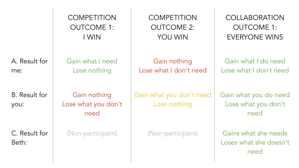
In this scenario we see our original example of competition as before, but in the collaboration outcome (which mirrors the example from the Netflix show I mentioned earlier) we see perfect resource distribution. It’s entirely voluntary and also consistent: for all participants, giving what we don't need is rewarded by receiving what we do.
Observations:
In practice, surely this reinforces the value of the behaviour to all participants! And that's how it's done. Describe this principle with billions of actors, immeasurable resources, new inventions, and a growing total sum of our collective wealth, and you have our global economy. To be clear, our economy is a collaboration-based system. It is not a competition-based system -- even though it does still contain elements of competition, that does not form its basis. And even in the fringe cases where there are still monopolies and monopsonies, there can still be mutual-benefit collaboration. Collaboration is always an option; commercial inequality is a choice, not a foregone conclusion.
To be fair and equitable in our evaluation of competition and collaboration with this scenario, let's explore what happens to competition when we add the same complexity (an additional participant) that I’m advocating for in collaboration. For consistency we’ll add the same third actor, Beth, to the competition scenario.
In the competition chart above, what would the potential outcomes then look like if Beth participated in that winner-takes-all competition? Here’s the answer:
Observations:
- 25% of competition outcomes are favourable
- One competition outcome variant (in yellow) involves wasteful gain: gaining something that isn’t needed
- 100% of collaboration outcomes are favourable
In practice, surely this reinforces the value of the behaviour to all participants! And that's how it's done. Describe this principle with billions of actors, immeasurable resources, new inventions, and a growing total sum of our collective wealth, and you have our global economy. To be clear, our economy is a collaboration-based system. It is not a competition-based system -- even though it does still contain elements of competition, that does not form its basis. And even in the fringe cases where there are still monopolies and monopsonies, there can still be mutual-benefit collaboration. Collaboration is always an option; commercial inequality is a choice, not a foregone conclusion.
To be fair and equitable in our evaluation of competition and collaboration with this scenario, let's explore what happens to competition when we add the same complexity (an additional participant) that I’m advocating for in collaboration. For consistency we’ll add the same third actor, Beth, to the competition scenario.
In the competition chart above, what would the potential outcomes then look like if Beth participated in that winner-takes-all competition? Here’s the answer:
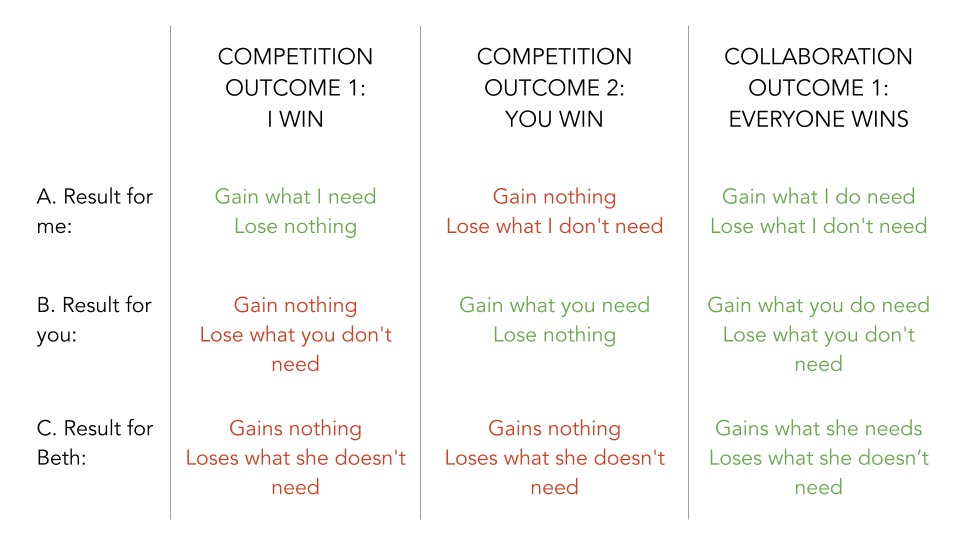
This, as you can see, is even worse than the first one-on-one competition example! Because now as well as people losing and not gaining, we immediately see we have created an unfair resource distribution that now means that we guarantee that all parties (except for the winner) will now have more difficulty getting what they need than if they just worked together in collaboration to begin with – because they have nothing left to stake or trade.
Observations:
If we consider this principle being applied directly to our economies and our politics, which affect our lives and livelihoods in numerous ways every day, the competition model disadvantages everyone except the wealthy few with the most resources (to whom it ultimately funnels remaining resources).
Only the collaboration model can ever benefit everyone.
So let’s use it. Please.
Observations:
- Notice the colour change? There is now a potential outcome where B can access a favourable outcome (that is, it’s now possible for you to gain what you need in the competition scenario rather than just gain a thing you don’t need)
- Competition now yields a 33% chance of 33% of participants receiving a favourable outcome
- Collaboration still yields a 100% chance of 100% favourable outcomes
If we consider this principle being applied directly to our economies and our politics, which affect our lives and livelihoods in numerous ways every day, the competition model disadvantages everyone except the wealthy few with the most resources (to whom it ultimately funnels remaining resources).
Only the collaboration model can ever benefit everyone.
So let’s use it. Please.
The Bottom Line
Mutually assured destruction of lives and livelihoods isn’t something we can accept. Such destruction arises from conflict. Therefore we should be wary of competition and the inefficient "win/lose" mentality baked into it. We should be wary of the false assumptions that compel us to think of common goals as mutually-exclusive and we should always ask how we can make common goals mutually-inclusive to benefit everyone. To assume competition is always the best option because it "worked before" is shortsighted and false. Why shouldn't everything we do benefit ourselves and others? It certainly can, sometimes even by accident, but we should simply plan it that way, and design interactions in which every party involved gets something of value out of it.
Instead of clawing madly for the opportunity to get our foot on someone else’s head for the psychopathic thrill of believing we’re better than other people, we should find ways to make sure we can be both selfish and generous at the same time. All this requires is that we dismiss the false idea that gain must always carry an equal or greater loss. That may be how it works for ions trading elections like pokémon, but it’s not how creating value works.
Ultimately we should involve this mutual-benefit mentality in our lives and especially in our livelihoods. Mutually beneficial dealings make profitable, sustainable businesses. At a larger scale, mutual-benefit planning grows economies, protects communities, and contributes to the lives of abundance that more and more people are gaining access to every day.
What About Games? They’re Competitions
Sports and other games are great examples of a type of competition that isn't intrinsically problematic. Sure the NFL has its problems (OK, every sporting institution has some major problems) but I don’t necessarily believe these problems aren't fundamental to playing of the games they institutionalise. Sports are games, games are play, and play can of course harmlessly take the form of competition. Whether it's a boardgame, a Formula 1 event, or a ten pin bowling showdown, the playing of games is not something I oppose...
...except where the stakes for winning are an item of need. I believe competition, contest, and play are not legitimate ways to allocate resources of need. Engaging in play contests for ones livelihood is fraught with potentially unmitigatable risk, (which I do consider fundamentally problematic). Consider a player on a sports team who loses their livelihood at the whim of a manager, and is left with a decade of investment in developing non-transferrable skills that may now leave them unable to earn their living without that institution. Let's consider these things every time we invest in these institutions. Our societies aren’t perfect, but that doesn't mean we should ignore those imperfections without due consideration. I've made a starting point for myself in writing this article to continue my thinking from.
I hope you will too.
Bonus Thoughts on Conflict
The views in this little bonus section aren't fully thought out so I'd appreciate your feedback
We sometimes hear the term "unnecessary conflict". That's a silly term. Like saying "soggy water" or "blowing wind". Wind by its nature blows, water is inherently wet, and all conflict is unnecessary. Yep, absolutely all of it.
So why do we believe so strongly (especially when we have chosen to be IN conflict) that it's not only necessary, but that we have been forced into it? That we have no choice? That “it's the only option"?
I can't answer that. I can acknowledge that when faced with an aggressor in a dangerous situation, conflict can seem viable. And as a response, of course an aggression response can be necessary. Even if I'm wrong and it's not strictly necessary, it can absolutely be a useful response option. I'll write more about aggression in a separate post.
But the conflict doesn't begin at the point of response. The conflict begins at the point of initial aggression, at the time the aggressor makes the decision to use conflict as a means of trying to reach their intended outcome.
So does it take two to conflict? Or does it only require one party to create it?
I don't know the answer. I suspect both might be right. It's my opinion (and I'd love this to become more informed please) that the instigator of a conflict, if it done intentionally, is accountable for all the consequences of the conflict, regardless of the actions of responders. In any case, the initiation of conflict is what I have in mind when I say "conflict is always unnecessary". It doesn't seem fair or right to hold responders to it accountable, since they didn't create the conflict.
Responding to conflict is just people doing their best when confronted with a lousy situation.
Initiating conflict is humanity at its most vile.
And those are not at all the same thing.
Where conflict arises from a misunderstanding, I would say that's also absolutely unnecessary, and tragically so. Especially when harm is done based on that misunderstanding.
Let's collaborate to make a world that benefits everyone.
Thanks for learning!
Michael


 RSS Feed
